


1. Introduction
How might we design a remote eye exam experience that feels clinically sound, frictionless, and intuitive for both patients and clinicians?
Traditional eye care still depends heavily on in-person appointments, even for routine prescription checks. That creates friction for patients who need to travel, wait, and fit appointments around their day, while clinicians spend valuable time on cases that may not require a full visit.
IbisRecheck is a browser-based product from IbisVision that allows patients to complete a prescription check from home. Clinicians can then review the results remotely and decide whether the patient can continue with their current prescription or needs an in-person appointment. I owned the end-to-end product design across the patient journey and the clinician review experience, working with the development team and product strategy lead to balance usability, accessibility, technical constraints, and clinical accuracy.
2. Who We Designed For
The product had to work for two groups with very different needs. Every design decision needed to reduce uncertainty for patients without removing the detail clinicians rely on.
Patients

Patients needed a quick and reassuring way to complete an eye check at home. They needed clear onboarding, simple instructions, visible progress, mobile-friendly layouts, accessible language, and confidence that the test was working correctly. Most had no clinical knowledge, so the interface had to explain what to do without exposing unnecessary complexity.

Clinicians

Clinicians needed to review pre-tested patients efficiently, understand the result at a glance, and identify who could pass, who needed review, and who required urgent attention. They needed filtering, clear result summaries, reliable reports, and an information hierarchy designed around triage rather than raw data.
3. Research highlights
I combined field interviews with product analytics so the redesign was grounded in observed behaviour rather than assumptions. At 100% Optical in London and Vision Expo in New York, I spoke with more than 20 patients and optometrists about remote checks, calibration, trust, and how results should be reviewed.


Patients repeatedly described uncertainty during setup and calibration. They were unsure whether they had positioned the device correctly, whether the room was suitable, and what would happen after the test. Clinicians wanted faster interpretation and less time spent searching through a data-heavy dashboard.
I then reviewed 53 recorded sessions in LogRocket. Only 15% of patients completed the full journey. Approximately 33% left on the home screen, 16% abandoned during calibration, 5% dropped when asked to rotate the device, and the remaining exits were spread across the rest of the test.

The research changed the brief. Patients did not need more features. They needed guidance, reassurance, and better feedback at the exact moments where doubt appeared. Clinicians did not need more data. They needed clearer hierarchy and triage-ready results.
4. Defining the Problem
The product was clinically functional, but it was losing patients before they could complete the check. Instructions were technically correct yet difficult to follow, the calibration flow felt fragile, and the hand-off between steps did not provide enough reassurance. On the clinician side, the dashboard presented information but did not make the next decision obvious.
That created three connected problems: low completion and retention for patients, reduced confidence for clinicians, and slower product adoption for IbisVision. Improving only one side would not be enough because the service depends on a complete patient test and a confident clinical review.

Problem statement
How might we make the remote prescription-check flow feel effortless and trustworthy for patients while giving clinicians a fast, triage-ready view of the results? This framing kept the work focused on comprehension, confidence, and safe decision-making rather than surface-level polish.
5. Design approach and solutions
I worked in focused design sprints tied to specific problems in the journey. Each change was reviewed with product and engineering, tested internally, released incrementally, and checked against fresh session data.
1. Onboarding and calibration
I simplified onboarding into a short progressive sequence that explains the goal, sets expectations, and prepares the patient, room, and device before calibration. Each step answers one question at a time and shows why the action matters. This directly addressed the 16% calibration drop-off and gave patients a clearer path beyond the 15% completion baseline.


2. Accessibility and visual clarity
The interface was strengthened with high-contrast states, clearer focus and feedback, screen-reader considerations, responsive mobile layouts, and concise microcopy. Instructions were rewritten in plain language and unnecessary decisions were removed so the experience remained usable under stress, on smaller screens, and for people with different levels of confidence using digital products.

3. Clinician dashboard
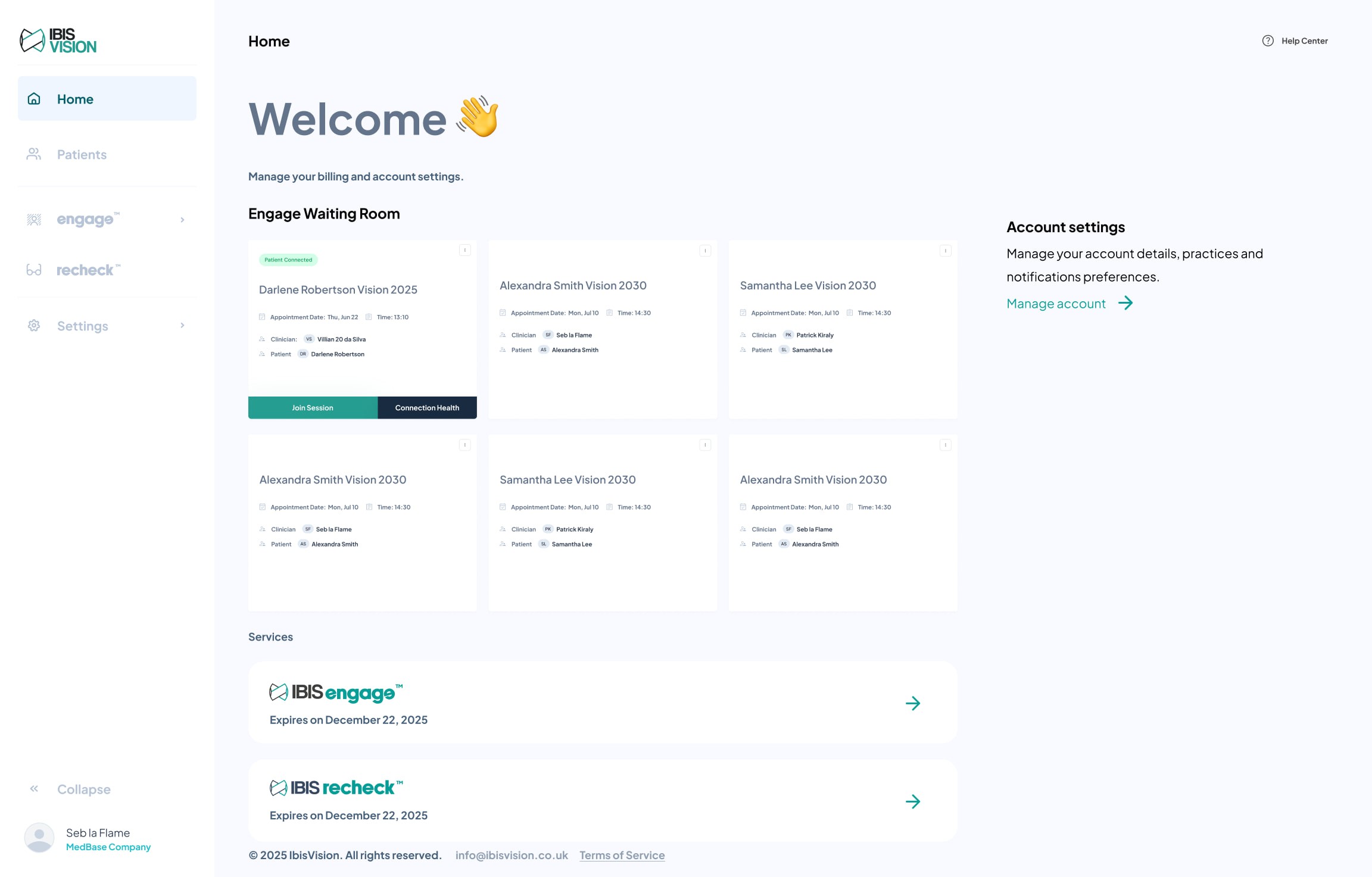
I reorganised the clinician experience around decisions instead of raw test data. Smart result cards, clearer summaries, and Pass, Needs Review, and Critical states helped clinicians see priority cases quickly. Filters and report structure supported the way clinicians actually triage patients rather than forcing them to interpret every result from scratch.

4. Reducing cognitive load
Across both experiences, I reduced clicks, simplified dense information, and turned the journey into a guided conversation rather than a form or spreadsheet. Progress indicators, contextual feedback, and calmer visual hierarchy made each next action obvious while preserving the clinical detail needed behind the scenes.
6. Testing and results
The redesign was tested continuously rather than left for a single hand-off. I used LogRocket to compare behaviour before and after releases, design-sprint reviews to catch technical and clinical issues early, internal QA across devices, and direct clinician feedback to check that new result states supported safe decisions.
The clearest gains appeared at the moments we had identified in research. Abandonment during calibration fell by 27%, overall test completion increased 2.1 times, and clinicians reported greater confidence when reviewing and triaging results.
The most important takeaway was that reducing uncertainty improved more than usability. It improved trust and retention. Small changes to timing, language, feedback, and hierarchy had a measurable effect because they helped people understand what was happening and what to do next.
7. Impact
Patient retention increased by 42%, calibration abandonment fell by 27%, and the number of completed tests more than doubled. Clearer instructions also reduced avoidable support questions, while the redesigned clinician dashboard made it faster to identify the cases that needed attention.
The work contributed to IbisVision securing its first major clinic partnership with Black & Lizars. That partnership was an important commercial proof point for the remote-care model because it showed that the product could support a real clinical workflow, not only a controlled demonstration.

The outcome was not a single visual redesign. It was a more credible service across the entire loop: patients were more likely to finish, clinicians were more confident reviewing the result, and the business had a stronger product to take into clinic partnerships.
8. Reflection
This project reinforced how different healthcare product design is from optimising a conventional digital funnel. Clinical constraints, accessibility, trust, and the timing of feedback all shape whether a user can complete the experience safely. Simplifying the interface never meant simplifying the clinical standard. It meant making that standard understandable.
The strongest decisions came from combining three sources: direct conversations, behavioural data, and close collaboration with the people responsible for product strategy and engineering. Analytics showed where the journey failed, interviews explained why, and technical collaboration helped us choose changes that could ship quickly without weakening accuracy.
If I continued the work, I would expand moderated testing with a broader range of patients, create a more formal accessibility benchmark, and keep measuring clinician review time alongside patient completion. The project made one principle especially clear: in remote care, confidence is part of the product, not an extra layer added at the end.
Next step
Got a brief that needs untangling?
If this is the kind of thinking you want on your website or product, send me the rough version. I reply within one working day with honest next steps.


